Choose a colour that occurs often enough in the neighbourhood to sustain a walk. Red doors, signs and clothing can form a starting point, but define whether you mean a narrow hue or a broader family. If every warm colour qualifies, the exercise may lose its constraint. If only one exact paint shade qualifies, you may spend the whole walk searching rather than photographing.
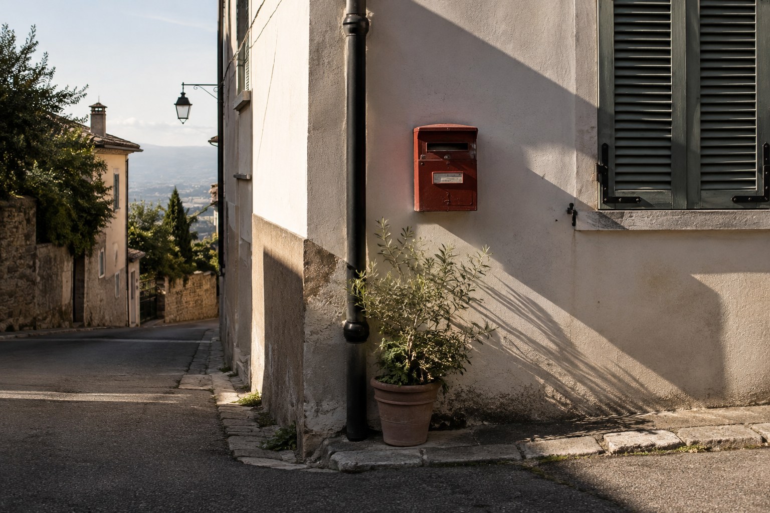
Begin with a small, obvious subject and include enough surroundings to show how the colour works. A red chair against a grey wall has a different effect from a red chair among several other saturated objects. Ask whether the chosen colour is an accent, a large field or a link between two parts of the frame. This gives successive photographs different visual roles.
Vary distance while keeping the connection
Make a close detail, a medium view and a wider scene when suitable subjects appear. You might photograph chipped paint, a whole doorway and a distant red bus against pale buildings. The repeated colour connects the images, while scale prevents them becoming a catalogue of similar rectangles. Do not include a weak photograph merely because the correct colour is present.
Watch how light changes the apparent hue. Shade, reflected shop lighting and direct sunlight can make the same surface look different. Consistent white balance within a similar lighting situation helps comparisons, but do not force every photograph to match one artificial red during editing. The surrounding colours and the material are part of what you observed.
Wait for a temporary relationship if it strengthens the picture, such as a coloured umbrella passing a matching door. Keep the frame ready and avoid following people intrusively. A connection between two stationary objects can be just as effective. The exercise is about observation rather than collecting strangers wearing the chosen colour.
At home, select a short sequence and alternate dominant colour fields with smaller accents. Remove near-duplicates even if they are individually attractive. Place two neighbouring images together and check whether their shapes, direction or contrast create a useful transition. Finish with the photograph that gives the sequence a sense of completion, not necessarily the one containing the most colour. A six-image edit can communicate the walk more clearly than thirty loosely related matches.