First ask what remains when colour disappears. A red object against a green wall may separate strongly in colour but merge into similar grey values. Conversely, a photograph dominated by lines, light and texture may become clearer without competing hues. Make a neutral conversion and assess the structure before applying a dramatic preset.
Look for a hierarchy of light and dark. The principal subject should have a readable boundary or a tonal relationship that draws attention. If every surface becomes the same middle grey, increasing overall contrast may not solve the problem. You may need to adjust how particular source colours translate into brightness, or decide that the colour version communicates more effectively.
Adjust colour channels with the image in view
Black-and-white mixing controls can brighten or darken areas according to their original colour. Move one control gradually and observe all affected areas, not just the target. Darkening blue may strengthen a sky but also change clothing or distant haze. Extreme changes can expose noise, uneven transitions or halos along edges where colours meet.
For a portrait, check skin, lips and background together. A conversion that makes skin very pale can remove shape, while a strong darkening can exaggerate blemishes or create an unintended expression. There is no single correct skin brightness, but the result should be a deliberate portrayal rather than a side effect of a preset designed for landscapes.
Set the overall contrast after the main tonal separations work. Keep detail where it contributes and allow simplification where it does not. A deep shadow can organise the picture, while excessive black clipping may swallow the gesture or object that makes it meaningful. Likewise, bright paper-like highlights can be effective without requiring every pale surface to become pure white.
Two colours that become one grey
A coloured flower against foliage illustrates the problem clearly. In colour, the petals may stand apart immediately. In a neutral monochrome conversion, petals and leaves can share almost the same tone. Test a small change to the relevant colour mix while watching the petal edges. If separation requires an extreme treatment that damages texture, the colour version may simply be the stronger photograph.
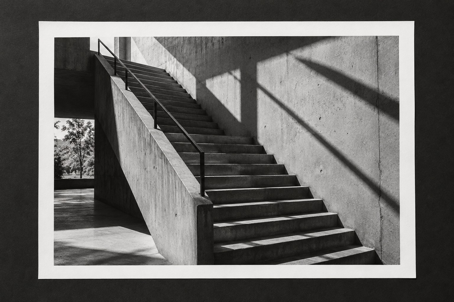
A building with repeated windows presents a different case. Removing small colour variations may make rhythm and spacing more apparent without much channel adjustment. Compare these two examples rather than applying one monochrome preset to both. The conversion should respond to the structural reason for using it, not force every subject into the same dark sky and bright foreground pattern.
Compare at the final scale
Texture and grain often look appealing in a large preview but become harsh or disappear at output size. Judge sharpening and any added grain after establishing the intended dimensions. Do not add grain merely to make the image appear old, especially if the subject and caption imply a historical photograph that it is not.
Place the monochrome and colour versions side by side. Describe what the conversion improves in concrete terms: a face separates more clearly, repeated shapes become easier to follow, or coloured signs no longer dominate. If the only answer is that black and white feels more artistic, reconsider whether the change serves this particular photograph.
Save the conversion as a reversible interpretation with the original colour source intact. A future print, sequence or publication may benefit from a different treatment. Black and white is most convincing when it clarifies the photograph's existing structure, not when it is used to conceal unresolved composition or poor light without examining them.