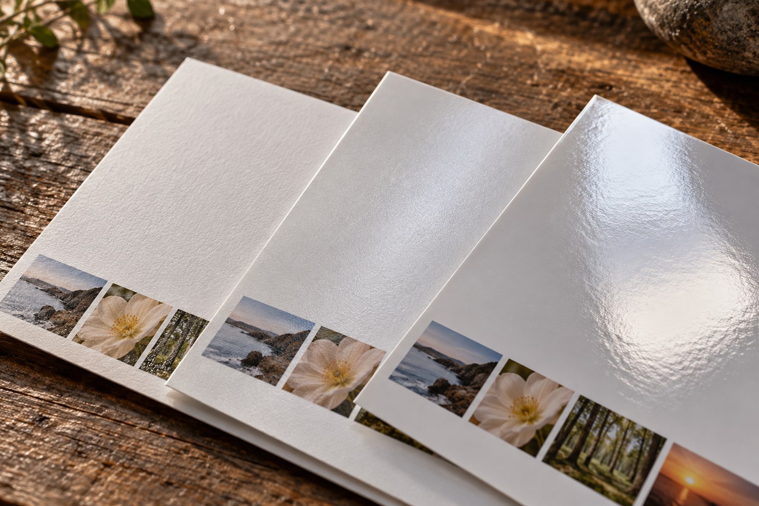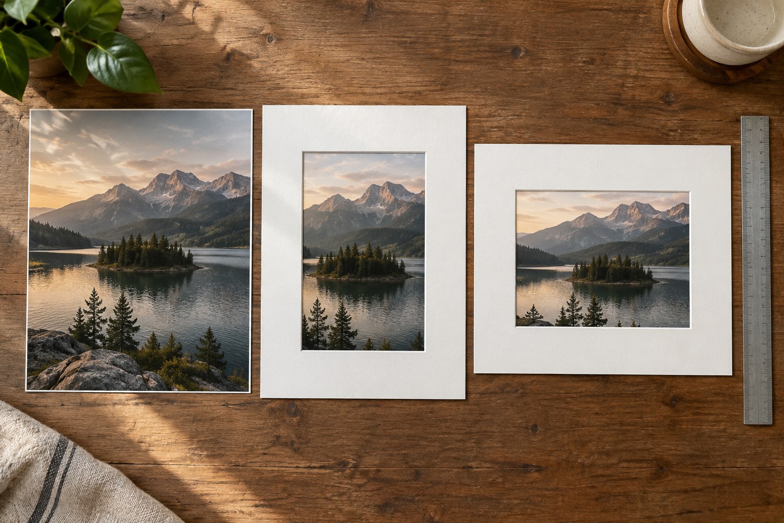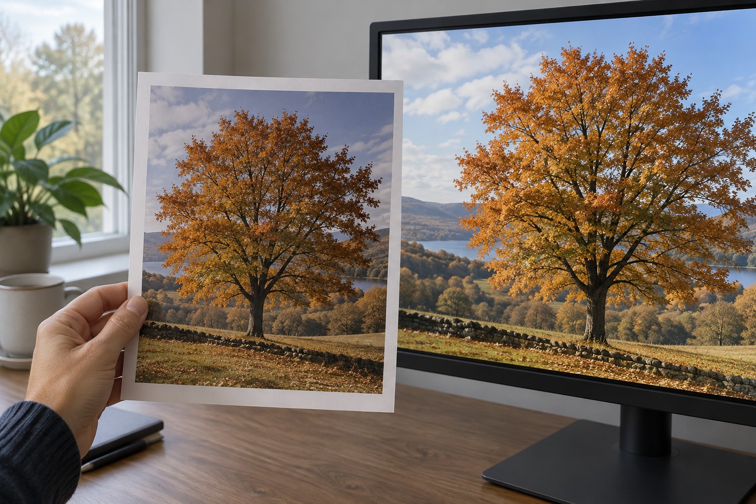
A screen emits light; a print reflects the light falling on it. Placing the two next to each other does not automatically create a fair comparison. A bright display in a dim room can make a correctly prepared print appear disappointing, while a strong coloured lamp can shift the apparent colour of the paper. Establish the conditions before deciding that the photograph needs another edit.
Choose a repeatable viewing position. Keep direct glare off the print and avoid a reflection across the part you are judging. Use a consistent light suitable for evaluating colour, following any guidance provided by the print service. Do not alternate between a warm desk lamp and daylight while making successive corrections, because each comparison then starts from a different situation.
Check the screen as a viewing device
Disable temporary display modes that deliberately change colour or brightness, such as a warm night setting, while evaluating the image. Let the monitor operate in a stable state and use a colour-managed application with the appropriate display profile. Calibration and profiling can improve consistency, but they do not make every screen capable of showing every printable colour or every dark tone.
Avoid setting the display to its maximum brightness merely because it looks vivid. The aim is a meaningful comparison under the chosen working conditions. If you use a measured display setup, retain its settings and check that the editing application is using the intended profile. Do not switch profiles randomly until one version happens to resemble the print.
Open the exact file that produced the print. A different crop, an earlier edit or an automatically enhanced service version can explain a mismatch that otherwise appears mysterious. Check the order options as well as the filename. If automatic image correction was enabled, record that fact before making assumptions about your own export.
Describe the difference precisely
Start with neutral and familiar areas. Is the entire print darker, or only the deepest shadows? Is a colour shift present everywhere, or mainly in one saturated object? Does a reflection obscure detail only from one angle? These observations point towards different causes. A global brightness increase cannot solve every one of them.
Use a paper profile for soft proofing when the application and printing workflow support it. Treat the preview as a way to anticipate limitations, not as a substitute for the physical print. The paper's surface, the room light and the viewer's adaptation remain part of the result. Consult the application's documentation for the exact proofing setup rather than applying a profile as an arbitrary creative effect.
If a correction is justified, make an output-specific version and label it clearly. Preserve the master edit for other uses. Adjust one relevant variable and order or produce a small comparison print with the same materials and settings. Keep the original proof beside it so that the decision does not rely on memory.
The goal is not to make paper emit the same light as a display. It is to produce a photograph whose important relationships survive the change of medium: a face remains readable, a dark shape retains its role and the chosen colour balance still feels coherent. Once those relationships work under the intended viewing conditions, further matching may bring little benefit.