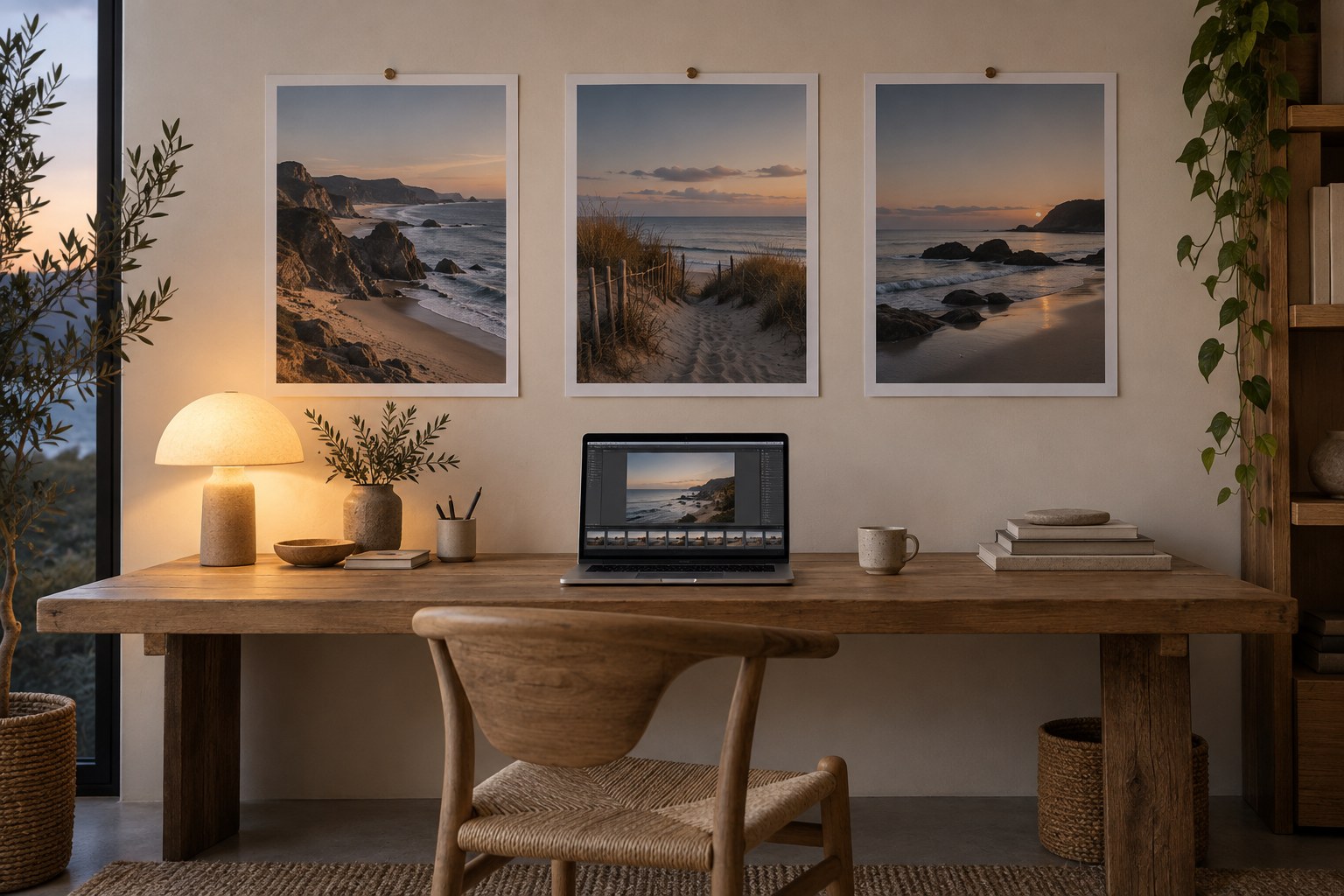
Choose a representative photograph as an anchor. It should contain the main lighting situation and colours of the group, not an unusually dramatic frame. Establish its white balance, exposure and contrast, then place the other photographs beside it. A contact sheet or comparison view makes small inconsistencies easier to notice than editing each image in isolation.
Group the series by lighting before copying settings. Pictures taken beside the same window may respond to a shared starting adjustment; a frame under a shop's lamps may need its own treatment. Synchronising one white-balance value across mixed situations can make the sequence less consistent rather than more. Consistency means a plausible relationship, not identical numbers.
Compare recurring references
Look at a repeated material or subject, such as a pale wall, a coat or a wooden table. If it shifts unexpectedly between adjacent frames under the same light, inspect white balance and exposure. Do not use a reference that is actually illuminated differently. The shaded side of a building should not necessarily match its sunlit side.
Check saturation after brightness. A darker frame can appear more saturated, and lifting it may change the impression without any colour-slider adjustment. Compare the principal colours at normal viewing size. One highly saturated image can dominate the series and make the remaining photographs seem weak even if they are individually well balanced.
Use local corrections when a small region causes the mismatch. A reflected colour on one face does not justify changing every neutral surface in the frame. Keep masks restrained and inspect transitions. If a correction requires many extreme local patches, reconsider whether the frame belongs in the same sequence or whether its different light should remain explicit.
A series that moves indoors
Imagine three street photographs followed by two images inside a café. Match the outdoor group first, then establish a separate coherent indoor group. Let the doorway or first interior image carry the change in colour atmosphere. Trying to make the café as cool as the street can erase the reason the interior feels different.
Within each group, compare a recurring object if available. A coat appearing in both settings may shift legitimately under the different light. Keep its identity recognisable without forcing an exact numeric match. This distinction between consistency within a lighting situation and continuity between situations makes the series more believable than a single blanket preset.
Keep changes visible when they are part of the story
A move from daylight into evening should feel like a change. Warm indoor light after a cool outdoor scene can provide a meaningful transition. Do not neutralise these differences merely to make a contact sheet uniform. Instead, prevent accidental jumps caused by inconsistent processing while retaining the actual progression of the visit.
Review the sequence on a consistent display with stable viewing conditions. Avoid editing one frame under a warm room lamp and another in bright daylight if the display environment influences your judgment. Take a short break and return to the whole set. Colour adaptation can make an increasingly strong cast seem ordinary when you stare at one image too long.
Export a small comparison set with the same colour space and output settings. Open those files together to confirm that the delivered sequence matches the editing view as closely as the workflow allows. Save individual adjustments as well as any shared preset. A coherent series should let the viewer move between images without noticing unexplained colour shifts, while still recognising the different light in which the photographs were made.