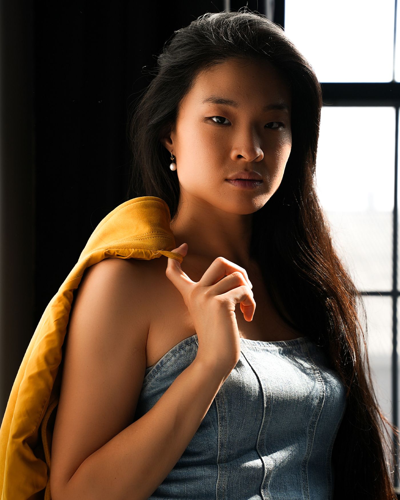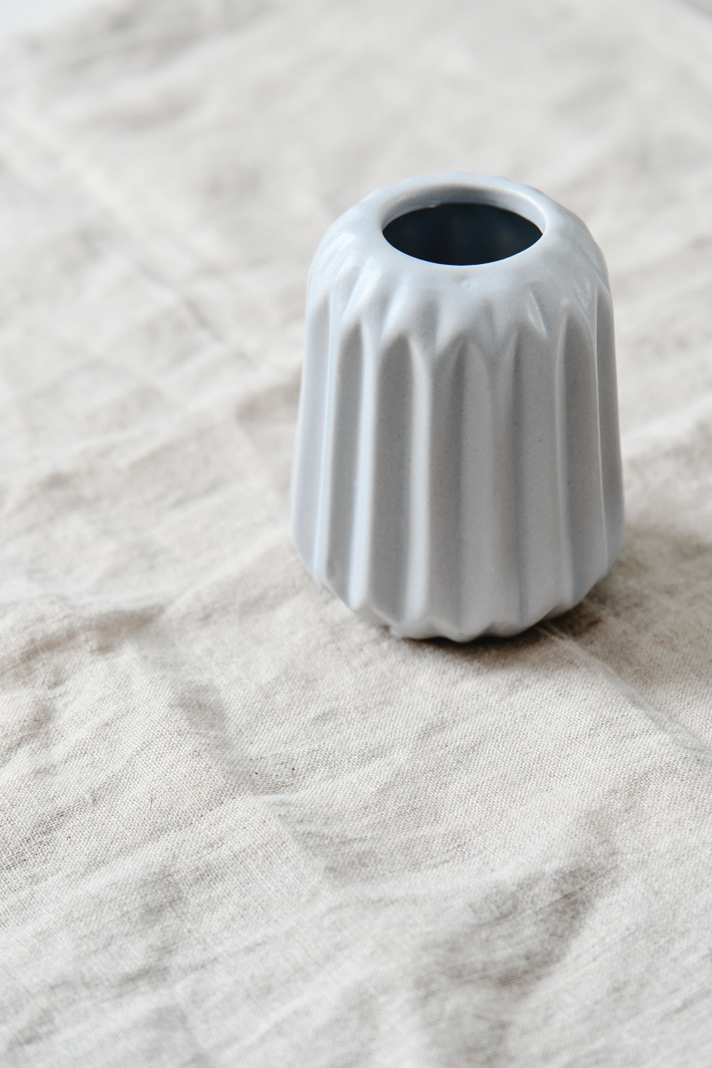
A white subject needs some tonal variation to show texture. If every pixel in a folded towel reaches the same maximum value, its weave and folds disappear. Yet exposing it too dark makes it look grey. The aim is a bright overall impression with enough room for the small differences between lit threads, recesses and edges.
Choose a white object with visible structure and light it from an angle. Side light makes shallow relief easier to see than light arriving directly from the camera position. A large window can provide gentle transitions; direct sun gives harder ones. Decide which suits the material rather than assuming that all white objects need soft light.
Separate the object from the background
A white object on a white background does not require both to have the same brightness. Move the object away from the background or adjust the light direction so that its edge remains visible. A pale grey background can still read as white in context while offering useful separation. Avoid adding a dark outline in editing to compensate for an edge that was never clearly recorded.
Take a test exposure and inspect the brightest textured part, not only the overall histogram. A histogram concentrated towards the right is expected for a predominantly white scene. It becomes a problem when important areas pile up at the boundary and lose detail. Increase exposure cautiously if automatic metering has made the object dull, then stop before the needed texture clips.
Check the red, green and blue channels when the lighting is strongly coloured or the material has a subtle tint. A combined brightness display can conceal a clipped channel. A neutral white balance reference helps you distinguish a real cream fabric from a warm lighting cast, although it cannot make mixed lighting uniform across the object.
For a close view, ensure the texture is actually in focus. A shallow depth of field can remove the weave from the far fold even when exposure is correct. Move the camera or object to align the important surface with the focus plane, then choose an aperture that covers the remaining depth.
Judge the result on its intended background. A white towel surrounded by a dark page looks brighter than the same photograph against a white page. Keep a version with restrained highlight adjustments and compare it at normal size. Texture should remain available without making every crease look heavily outlined or dirty.